Monday, April 15, 2013

Who's Your Friend When Things Get Ruff? Part 2

Remember when I posted roughs for my redesign of the old Sid & Marty Krofft tv show character H.R. Pufnstuf? I said back then that I'd love to do a finished color version of him when I had the time. Well two years later, here we are! I've been playing around in digital ink & color over the past two weeks, so I came back to this design as an exercise. I think I may go even further with him and give him an actual background, maybe see a bit of Living Island. WHATTT?? Completely unheard of, I know. But I just love this design so much, I'd like to do something complete with him. Until then, here he is with digital inks:
And in full glorious digital color:
For those of you that didn't get to see the original thumbnail and roughs, click this LINK to go to that post.

Thursday, April 11, 2013

Doctor Who: The 10th Doctor

This is the first of my Doctor Who series, and my first attempt at fully digital inks. It took me a good week of working a few hours per night well past midnight, watching many tutorials, and a whole lot of trial & error, but overall I'm very happy with it. This was done in Photoshop CS6, recreating each line one by one. In retrospect, probably not the fastest way to go. But honestly, this was just intended to be a Photoshop color sketch, as my previous postings have been. But the pencil-lined pinstripes on his suit were a messy disaster. So I erased them and made nice clean digital pinstripes. And then since I did those I thought, let's make those little details on his tie look nice and slick. And hey, since I have to fix his nose to make it look more Tennant-like, I might as well clean that up too while I'm at it, right? And so on, and here we are.

Next up is the 11th Doctor, who will be my first attempt at digital inks in Illustrator. Which I imagine will be immensely faster than Photoshop, and even slicker looking than this. Look at me, finally entering the digital age! Onwards & upwards, my friends. ALLONS-Y!

Wednesday, March 27, 2013

POKEMON: Gotta Catch 'em all! (Part 1)

There's no long story with this one. My 11-year old is a huge Pokemon fan. This little guy, Fennekin, is his favorite one, so I drew my version of him for his birthday. I'm extremely happy with how this came out, and I have to say, now I can see how kids become so obsessed with them. It's 3am, and I should have gone to bed hours ago, but I felt a nagging need to finish him up before I called it a night. Tomorrow might be a little rough, but I enjoyed this enough that it's worth it. Not only that, but I liked drawing him so much that now I want to draw MORE (all??) of them! But for now, here's my first attempt.
This is the original design (on the left), my rough sketch (on the right), and the finished design (below).
Hope you guys like it as much as I do!


Monday, February 25, 2013

Cruisin' For Crazy

I've been wanting to finalize my redesign of Crazy Boy since I posted the redesign of his nervous partner Tinklefish about...wow, two years ago! I finally had a reason to, so here he is in full-on crazy color!
So, what's the reason? I've recently signed a deal to have Breakfast Monkey toys made! And also Witchamazoo toys! Exciting, right?? So over the next few weeks, I'll be posting updated designs and turnarounds of my characters as I finish them up for toy production. 

WHILE YOU'RE WAITING, please take a few seconds to answer this short survey (only 5 questions) and tell us in the comments box how much you're looking forward to Breakfast Monkey toys! And please share this with everyone you know that's a BMonkey fan! I promise it isn't spam or a virus.

Sunday, November 11, 2012

Hard Boyle'd Halloween, Part 2

 So a little over a year ago, I was talking about an idea I had for making paper mache Halloween masks in the style of vintage Ben Cooper masks. And posted a few thumbnail ideas. (In case you missed it, you can read it here.) I finally found the time to do a few of them, and I am officially addicted.

 I kept the sculpting to a minimum on the first one and chose to focus on the painting style. What I found was that as much as I tried to keep a "pop-art" sensibility, I couldn't help but bring my cartoony style to it. The result was more like my 2-dimensional cartoon designs in 3-dimensional form. Not exactly what I envisioned,  but I'm in love with it.


 I got a little more sculpty with the second one, really building up the nose & chin, and opened the mouth up. 


 For the next one, I branched off from the devil masks and mad a Christmas devil, the Krampus. This time, I got super-sculpty, and I added some fur accents. It's a hell of a lot more work, but the end result is worth it. Here's the face fully painted:
        
And here's the finished mask with fur and ears added:


I plan to make a few variations of Krampus masks for the Christmas holiday, along with some other creatures. I'll be posting more masks over the next few weeks. If anyone is interested in buying them, they're up for sale in my Etsy store.

Thursday, July 12, 2012

Mister Mxyzptlk

 I've said it before, I seem to have a thing for offbeat interdimensional characters. You've already seen me draw two of my favorites from DC Comics, Bizarro & Bat-Mite. Another one of my favorite DC troublemakers is Mister Mxyzptlk (pronounced mix-yez-pittle-ick). He's had a few different incarnations/interpretations over the years, so the first question was, which version to go with. There's the original "Earth-Two" version, who's a little bulbous-headed imp-ish smart alec in a purple suit. Then there's the more modern version who looks part Looney Tunes/part Willy Wonka, with wild white hair and a Jetsons space suit. 
 I couldn't decide, so I went with BOTH. I started with my favorite elements.I like the white hair, and I really like what Bruce Timm's crew did with him in the 1990s Superman animated series. It's a cartoonier version of the Earth-Two design. He just looks like a funny little guy who's up to no good. As opposed to the modern comic book version, who looks like a creepy little old man from outer space. So I went somewhere in-between. I kept the white hair, but tried not to make him look too much like an old man. I gave him a bowling pin-shaped body and weird head shape that's almost that makes him look alien-like. I wanted him to look like he's from the same world as my version of Bat-Mite. (For those who don't know, Mxy & Bat-Mite are both from the same dimension). One thing that both new & versions of Mxy share is the little purple bowler, so I kept it. Kameron Gates did this creepy version of Mxy that had his hat floating over his head, and I really like that idea, so I used it here (thank you, Kameron!). And I like him smoking a cigar. Why a magical creature from another dimension would be interested in smoking a stogie, I have no idea. but I like it. So finally, this is what I came up with:
 In the clean-up version, I extended his name in the smoke so that it arced over his head a little better:
 And finally, the color version. All-in-all I'm pretty happy with him, though I'm aching to learn how to ink & color these digitally. Hopefully soon. But for now, voilĂ !
 Feel free to comment, critique, or make suggestions for my next character. Actually, looking now at my old drawing of Bat-Mite, it looks amateur-ish and not as polished as this drawing of Mxy. (The perfectionist in me has a tendency to think that about ALL my old drawings). So I might take another stab at the lil' bat guy...


Sunday, June 24, 2012

Saturday Morning Redux, Part 3: The Groovie Goolies

 It didn't take more than a simple request from a friend on Facebook to get me to draw these guys. Like Fangface & The Impossibles, The Groovie Goolies were one of my very favorite cartoons when I was a kid. Firstly, they were the monster relatives of Sabrina the Teenage Witch, who was my first cartoon crush. That and the fact that they were cartoony versions of Dracula, Frankenstein's monster, & the Wolfman made me instantly love them.
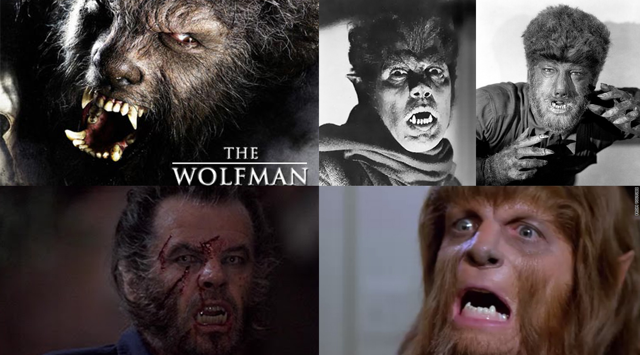
 The problem is, when I really sat and took a look at the original designs, my first thought was that they were pretty perfect as is. There isn't much that I would change. Then I reached into my 5-year-old brain and thought of the things that I didn't like about them when I was a kid. For starters, it bothered me that Wolfie just looked like a bearded hippie. Yeah, I get that they were supposed to be groovy, but aside from the fact that he had a funky howl, I remember thinking that there wasn't much that was very wolf-like about his design. If he resembled any kind of animal at all, he looked more like an orangutan. So I wolfed him out. I tried to still keep the hippie-factor, but made his facial hair look less like a beard and got rid of those two big dopey hair-antennae, which I never liked. And I gave him wolf teeth.
NOTE TO ARTISTS DRAWING MONSTERS: Vampires have fangs, werewolves have a sharp underbite! Get it right already, jeeez!
So this is how he turned out (with the original on the left for comparison):
 Next it was on to Drac. Drac was tough, because I really like this design. The only thing that bothered me about him when I was a kid was that he seemed to much like a crabby old man. And again, I get that it's probably what they were going for, but I think you can achieve the same personality while making him a bit younger and a bit more cool. After all, the whole concept was that these were cool modern monsters of the 1970's right? To be honest, if I was REALLY going to redesign him, I'd probably put him in an Austin Powers type of suit, but I didn't want to stray too much from the original. This is how he turned out (again, with the original design on the left for comparison):
 Lastly, there was Frankie. Again, there wasn't much I'd change here. His face is really great and I love his posture. The only thing I wanted to really change was to make him a little less skinny & frail. His design looked like he was the Frankenstein monster's grandpa. So I made him a little more thick & weighty with big meaty hands, because I like the top-heavy aspect of the original design. He's just a great big oaf. But I still wanted to keep the gentle nature to his face, and that great curl of hair in front of his ear. Why? I don't really know, but I love it! Here's how he turned out (yes, with the original on the left again for comparison):
And finally, here's the gang all together:
And the black line art, so you can see what was going on before I added color. Up until recently, I've been holding off on doing any finished line art, because I haven't learned how to ink on a Wacom yet (and everyone's already moved on to cintiqs!). So what you're looking at is simple micron pens, scanned and colored in Photoshop. Which is cleaner than pencil roughs, and will have to do for now until I fully join the digital world.
 Hope you guys like them as much as I do! Feel free to leave comments, critiques, suggestions, and offers of jobs with lots & lots of money. ;-)