Wednesday, September 6, 2017

Woodcrest Elementary School Sharks

So, my old pal Principal Jon Cohen, who hired me a few years wback to create the school mascot & new logo for Red Bank Elementary School, is Principal at a new school, Woodcrest Elementary. And so he asked me again to design a new logo and mascot for his new school. This time the mascot is a shark. As I found out when I started sketching him out, it's super hard to create a friendly little kid version of the planet's most feared predator. Here are a few of my initial roughs that didn't quite make the cut:
It took a while until he was finally starting to look fun and kid-like. 
Then I also thought every good nautical cartoon character has a decent sailor hat, right?

So, in the final pencil sketches, I tried a few out on him.

The sailor hat was the winner! So I cleaned him up (no nostrils!):
Then added some color:

And then I designed a new Woodcrest logo, using elements requested by the client, like the squeezed text shape with the bite taken out of it and the bubble background. And here's the final version. Last I heard, everyone loves him, including the President of PTA! WHEW!


Friday, February 3, 2017

#meettheartist

This was my contribution to a social media project hashtagged #meettheartist. Granted, most of the artists that I saw participating were a lot younger or even art students. But I was inspired by a lot of the art that I came across and I'd been wanting to do a decent self-portrait for a while now. I was never really happy with the one that I did back in 2011. I think my work has gotten a lot more solid since then. I'll probably be saying the same thing about this one 6 years from now. 😆

So, here it is:

And here is the original line art, done with a flair pen cleaned up in photoshop:

Saturday, December 3, 2016

Scooby-Doo: The Spooky Space Kook, Part 2

Two years ago, I did a  drawing of the Scooby-Doo villain, The Space Kook. I always wanted to go back to that sketch and do a nice, clean polished version of it. I had to teach myself how to make a gif with audio, so I came back to this guy. One of the things I like about him is the eerie red strobe effect that happens in his helmet when he laughs:


So I wanted to replicate that with my drawing. So first, I finally had the chance to do a nice slick version of him:


Then I created a slightly modified laughing mouth pose. And next, I colored his skull and inside helmet with black and red color schemes and some variations on the outer glow. I made 6 different frames altogether, pulled the audio from that YouTube clip, dropped it in and matched up the action. And voilà!


Wednesday, October 19, 2016

INKtober 2016: Cereal Monsters!

For this year's INKtober, I knew I wasn't going to have enough time to do a daily drawing. So I kinda cheated and created an INKtober project for myself. I wanted to do something monstery like I did last year, and I'd always wanted to take a stab at the Monster Cereal guys.
Every couple of years, General Mills updates their designs, but I've never really cared for them like I do the originals.
The challenge was to do something fun with them without straying too far from what I liked about them in the first place. The fun part here was taking a closer look at these characters to see how they tick and having the freedom to push the designs without having to worry about them being on-brand. If I were to actually redesign them (Which I would LOVE. Are you reading this, GM?), I'd have to take a slightly different approach. 

First was Count Chocula. And for the first time I realized that isn't a funky headpiece he's wearing, it's his hair! So the first thing I did was made his hair look like actual hair. Then I just kind of grittied him up and made him look like a grizzled old vampire. But kept his silly bunny fangs. I regret only doing a headshot. I'd like to come back to this and add a body.


 Next up is FrankenBerry. Because of his mutant moon head, I felt like it needed to be veiny like the thing from "This Island Earth". And building on his metal parts, I gave him a hinged metal jaw like Hanna-Barbera's Frankenstein, Jr.


Next up is Boo Berry. The obvious aspect of this character is that his voice is an imitation of Peter Lorre. So I added a little more of that in his face. His hate never made sense, and it wasn't until now that I realized that it was just a poorly draw version of the hate that Peter Lorre wears in "Secret Agent". So, if Count Chocula wa a parody to Bela Lugosi's Dracula, and FrankenBerry was ripping on Karloff's Frankenstein monster, then Boo Berry is the ghost of Peter Lorre! Who knew!


 I had a lot of fun with Frute Brute! I've mentioned before that I have a thing for werewolves, so this guy was my favorite when I was a kid. But man, his design was so lazy and boring. I liked what they did with him in the tv commercials, though. So I started from there. Since nobody is really attached to him, or doesn't know him at all, I pushed this design pretty far and turned him into a snarling wolf beast. And added a touch of Ruby-Spears' character from the 80s, Fangface (who I also did my version of a while back, OVER HERE). But I still kept the silly overalls and his big orange nose and all the things that make him Frute Brute. I liked this one so much that I spent a little more time on him than the others.


And lastly, there is Yummy Mummy. Who, you ask? Yeah, I know. Not many people know that Frute Brute existed, but even fewer have ever heard of Yummy Mummy. Or Fruity Yummy Mummy, to be exact. I guess they didn't want you to confuse it for Ground Beef-Flavored Yummy Mummy, or Pipe Tobacco-Flavored Yummy Mummy.

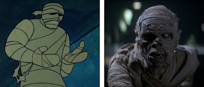
Aside from his terrible name, his design looks like something from a cheap greeting card. It has zero personality and nothing that makes him unique like the others. Just a lazy generic cartoon mummy with colorful bandages. It's no wonder he was so forgettable. So, I tried to make him a little interesting. I played up the undead factor and added elements of two of my favorite Mummies: the Mummy from the movie "Monster Squad"and the Mummy from Scooby-Doo ("Coiiinnn...Coiiiiinn..."). And here's what I came up with. Hope you like him!

And that's a WRAP (get it?) for this year's INKtober! Happy Halloween, everyone!!

Tuesday, September 27, 2016

More Scooby-Doo!

Around this time last year, I drew my versions of classic Scooby-Doo villains for INKtober (If you missed them, check them out out here, here, and here). Recently, a friend of mine showed me some original Scooby background paintings on the Secret Fun Blog. And first of all, WOW. Those are some gorgeous paintings. I also learned that ex-Disney artist Walt Peregoy was the one that set the style of the show's backgrounds on season one. Right away, I thought how much fun would it be to put some of my villain redesigns on an authentic Scooby-Doo background! So took a few of my favorites, cleaned them up (which I'd been wanting to do anyway) and recolored them and dropped them in. I'm in love with the result! What do you think?


With this last one of Charlie the Funland Robot, I took a little extra time and added digital inks and color in Illustrator. Super slick! The original post for him is here.


Tuesday, April 12, 2016

Heat Miser/Snow Miser

 I've noticed that I have a bunch of fun sketches on my facebook that I've never posted here. And maybe that's because I try to post mainly polished-up art on this blog, as opposed to rough unfinished stuff. But sometimes that rough unfinished stuff is just fun, and doesn't need to be polished up, right? And I think this is one of those exceptions.

 The Rankin-Bass stop-motion"animagic" holiday shorts are among my most favorite things in the entire known universe. And those guys (Paul Coker, I'm looking at you!) were amazing character designers. They have so much life and personality and they're so engaging, and I think that's a big part of why people love those mini-movies so much. I think this was Christmas 2014 that I sketched up two of my favorite characters, Heat Miser and Snow Miser. Honestly though, who doesn't love them? Here they are in a screen grab from "The Year Without a Santa Claus":


And here is my take on the big hams:

 Like just about every rough sketch that I do, I'm hoping to do a more cleaned-up version of these, maybe for next Christmas. Until then, I hope you enjoy!

Tuesday, April 5, 2016

Zootopia: Nick Wilde

Went to see Zootopia and was blown away with how good it is, on so many levels. But the character designs are what really stood out to me. Cory Loftis really killed it! Disney has always been the best at designing compelling, anthropomorphic characters. My favorite has always been Robin Hood. But Zootopia takes the aesthetic of movies like Robin Hood and pushes it so far above the bar. Nick Wilde is such a great character. I love his expressions, his body language, and how it all works perfectly with Jason Bateman's voice acting. Plus, I have a thing for foxes, especially cartoon foxes. So I had to sketch him up. And then I colored him using some new photoshop brushes. I'm pretty happy with how he came out and I hope I captured some of his cool, laid back spirit. What do you think?